
The story behind the CFL's new Indigenous-themed logo
 Don Landry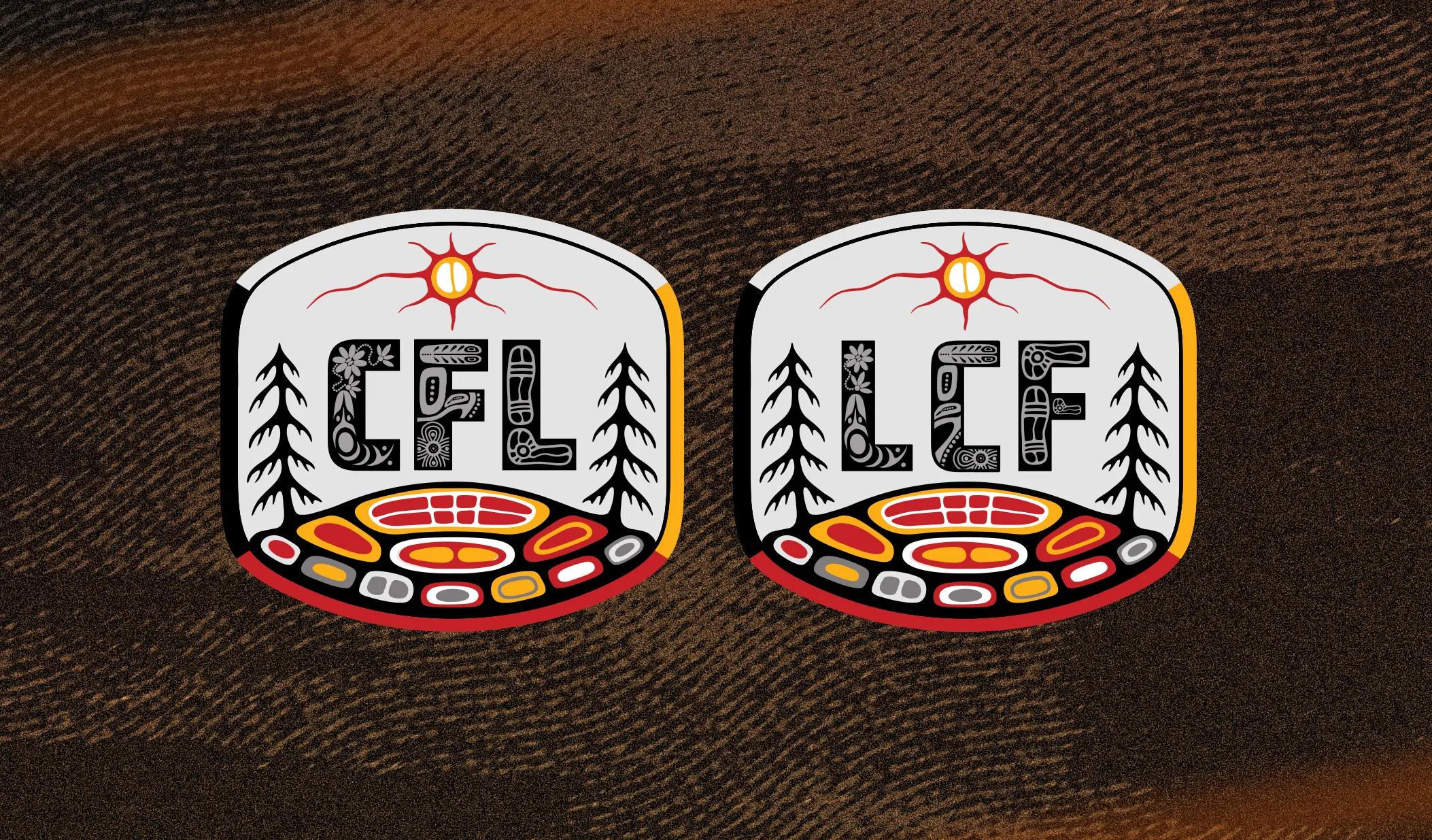
For artist Chris Mitchell, the journey to finalizing the CFL’s new, Indigenous-themed logo was one chock full of designs, re-designs and then even more re-designs.
“So many rough files and sketches,” he said with a chuckle.
One of three Indigenous artists who were chosen to take on the project, Mitchell recalls the high tide of creativity that came to him and his two associates when they were first asked to tackle the logo, last May.
“You have all these really fun ideas and possibilities,” he said.
“The problem,” he went on, “is you have to pick one.”
The “one” is now proudly displayed by the Canadian Football League, joining the full roster of Indigenous-themed team logos that adorn each member club’s helmets in recognition of, and leading up to, the National Day of Truth and Reconciliation on September 30.
It’s a gorgeous rendering, combining a number of Indigenous artistic styles, and the artists involved in its design come from three distinct areas, coast to coast.
Mitchell is now based in Toronto, but was born and raised in Halifax, which is in the sprawling Maritime territory of his ancestors, the Mi’kmaq.
Christian Kent is a Winnipegger from the get-go, tracing his lineage to the Sagkeeng First Nation, located about an hour north of the city, on the East side of Lake Winnipeg.
And Brooke Jewell is of Cree-Métis heritage, originally from Athabasca, Alberta. She’s made her home in the lower mainland of B.C. for more than 25 years.
All three are on the roster of ChangeMakers, the communications firm that the CFL asked to bring the new logo to life.
“They are a dream team,” said ChangeMakers VP and Creative Director Whitney Siemens of Jewell, Kent and Mitchell. “It's phenomenal to have such talent. They all contribute these really wonderful different things.”
While they sifted through idea after idea, the team stayed cognizant of an important consideration: widespread representation.
“It’s got to speak for a whole country,” explained Mitchell of a key guiding principle. “There’s hundreds of different nations.”
Out of all the design possibilities that were born during the process, the group managed to shrink the field to eight candidates before the final design was decided on just a few weeks ago.
“I think that it really touched all of us,” said Jewell of the chosen logo, “and once we had that straightforward decision of which one we were going to pick, everyone had their input.”
There is a lot going on in that logo and it is not by accident.

The pine trees on either side were chosen not just to balance the design, but because they are a part of the national landscape, found coast to coast.
“We had a few different versions where, it's like, plains in the middle, mountains were on the left, and then trees on the right,” explained Mitchell. “But we wanted to make it more symmetrical.”
Those pines emerge from the logo’s colourful base, rendered in a style that honours that of traditional Eastern Woodlands Indigenous artists, and the celebrated Norval Morrisseau, who founded the Woodlands School of Art and who was known as the “Picasso of the North.”
“It has a soft flow to it,” said Kent of the overall feel. “This is sort of our interpretation of the natural world, the trees, the grass, the rocks, the flowers.”
Honouring the story of Turtle Island — a culturally and spiritually significant one — was important to the artists as well.
“We felt like the Turtle Island story kind of lent itself to ideas of reconciliation and representing our indigenous heritage, inclusively, across Canada,” said Kent, who also served as narrator for the CFL’s logo introduction videos.
“It’s the story,” explained Jewell, “that at one time the world was flooded and the turtle rose out of the water to be able to put earth on it so that humans could live.”
“The CFL team really loved the storytelling of Turtle Island,” added Siemens. “It really captured that national presence because, as we know, Turtle Island is literally a national piece that's tied to all of our indigenous cultures.”
While the overall design could be thought of as a composite, the individual style of each of the three artists shines through as well, in the lettering.
“The artwork within the ‘CFL’ and the ‘LCF,’ those are strictly our individual designs from our areas,” said Jewell, adding that hers is on the left, Kent’s in the centre and Mitchell’s to the right. West, Central, and East.
“We really wanted to make sure that all Indigenous peoples across Canada could see themselves in this brand,” said Siemens. “But we also wanted to make sure that we were sticking close to the integrity of the CFL logo. We wanted to make sure that it wasn't too too far of a departure.”
There were, the artists said, a number of ideas that could have been considered quite a change from the CFL’s standard logo. While they, too, had beauty and merit, the decision was made to ensure the new logo would pop as something different, while still being recognizable.
“What could we do that speaks to indigenous culture across the country,” began Mitchell, “but it's not so deep that a random passerby would be like ‘I have no idea what that is.’ It can be understood, right?”
After months of hard work and all of those sketches, ideas, designs and re-designs, after all those online meetings, the artists are happy with their final masterpiece. With it’s messaging and it’s beauty and it’s warmth. With its Indigenous storytelling and with its room for artistic individuality within an amalgam of creative cooperation.
“It catches my heart,” said Jewell. “I love to be able to have that out there and have people be able to share in the creativeness and the resilience and the thought that we should all be coming together.”
“We’re all super happy with it,” said Kent. “Excited to see it alive in the world.”